CheapTickets gets a new visual identity.
Moodboards become a thing.
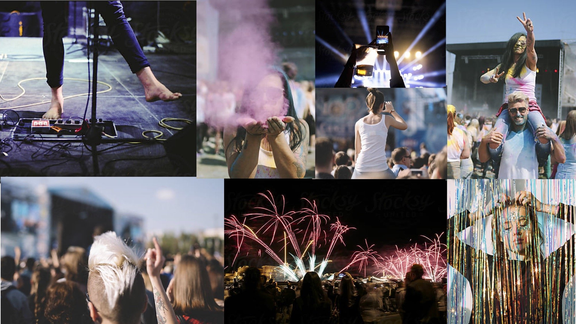
In 2019–2020, CheapTickets needed a new vibe. I reimagined the brand for a fresh audience—college students and recent grads tasting freedom for the first time, craving budget-friendly travel that felt light, loud, and alive.
I didn’t just contribute to the new look and feel. I built it.
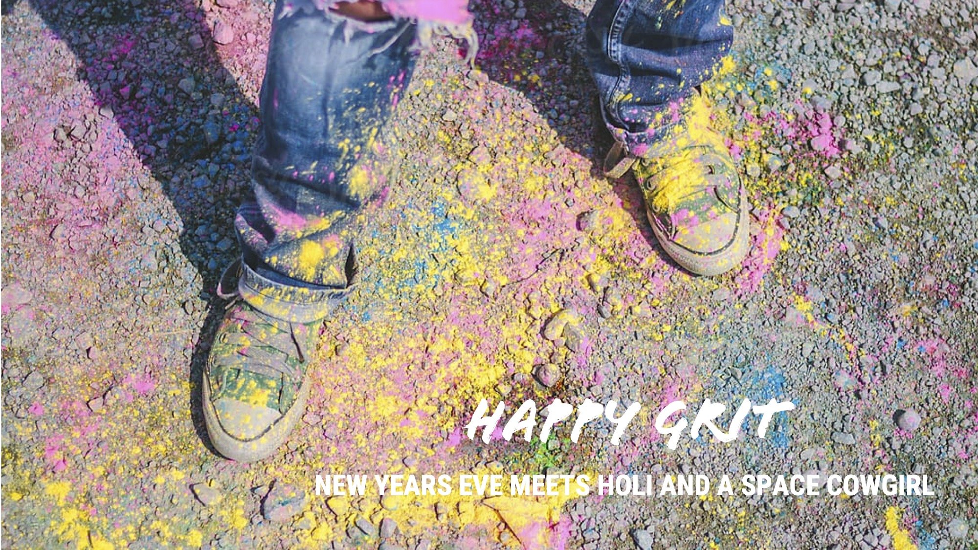
I coined the aesthetic: “Happy Grit.” It was raw, colorful, and unfiltered. Travel on a budget isn’t a low-cost transaction, but an expression of who you are.
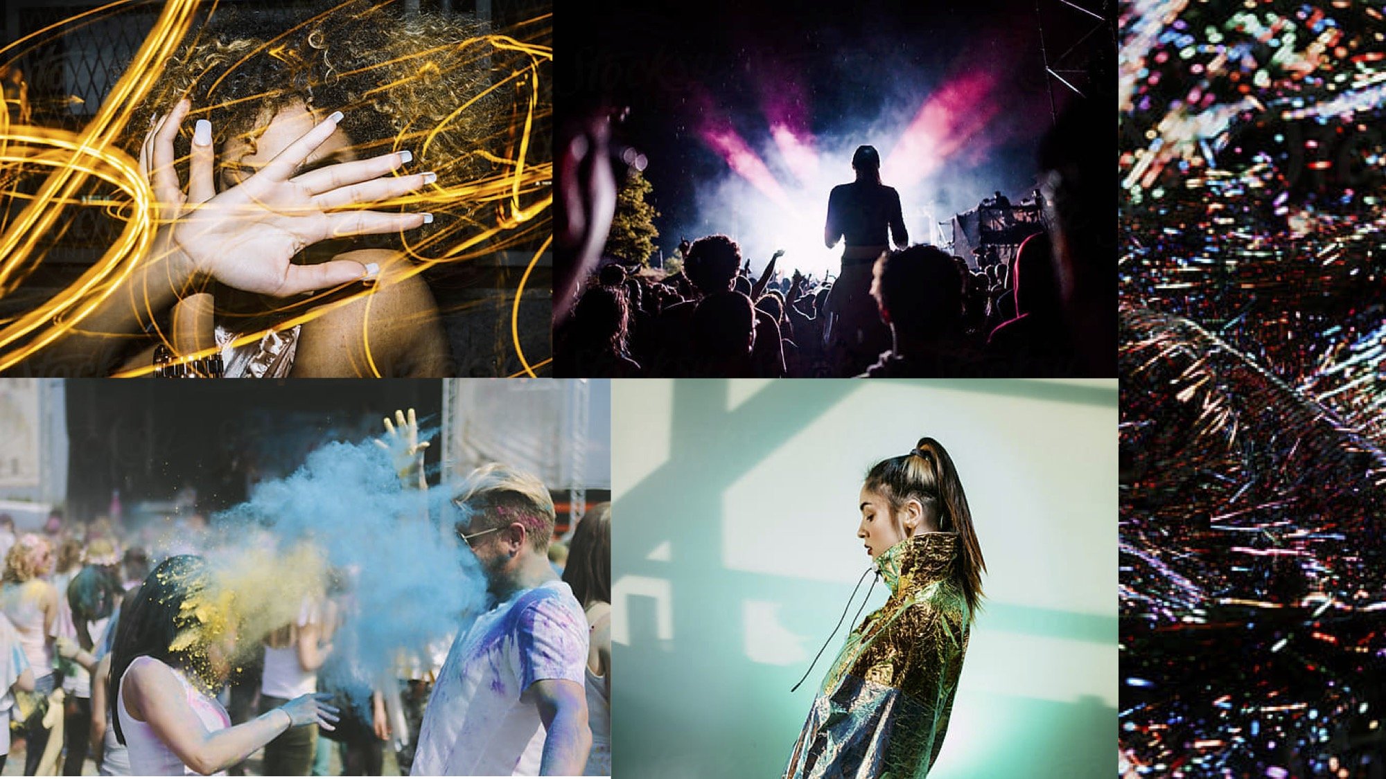
One of the boldest moves? I merged photography with irreverent illustration (what we called doodles) breaking the expected rules of visual identity and making the brand unmistakably its own.
This wasn’t a safe rebrand. It was a creative rebellion. And it worked.


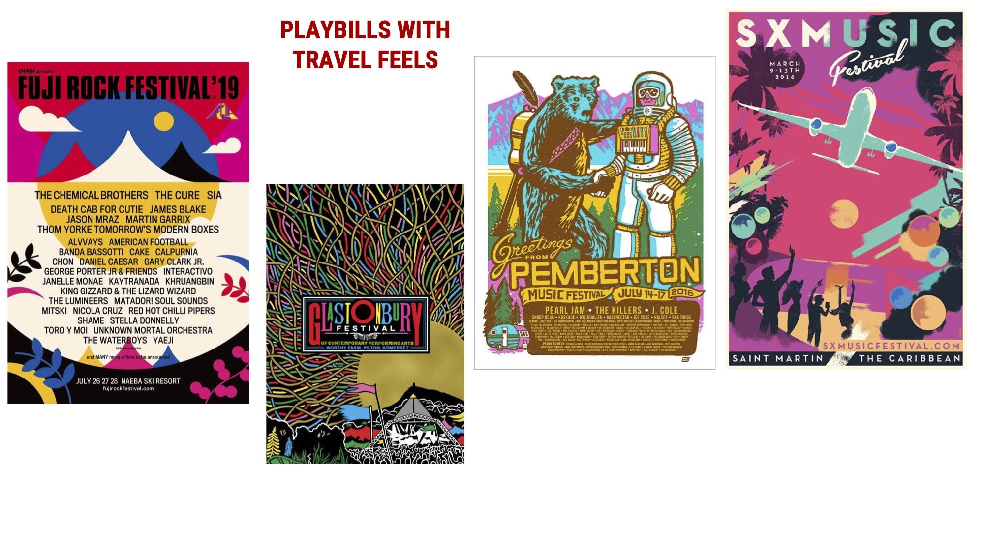
How moodboards became the new normal.
I introduced moodboards as a strategic tool—then made them standard. Before that? They weren’t even part of the process. Most teams didn’t know what they were. Until they did. And they were hooked.
We rolled them out as a new phase in every creative kickoff moving forward—across brand, campaign, and content. They became more than aesthetic exercises. They were cultural heat maps, gut checks, alignment tools, and imagination igniters.
This one—“fantastical reality”—launched the CheapTickets Cyber Week campaign during the first COVID holiday season, when no one knew up from down. Especially college students, living their own surreal flavor of pandemic life.
It shifted the conversation. And it taught the team how creative alignment is actually achieved—whether you’re a designer, a copywriter, a brand marketer or somewhere in between.